
Creating merch is always an exciting project. After a few sketches I decided I wanted to go with a typographic approach. The initial sketches were similar in shape to what ended up as the final design.
I wanted the final design to have a fair amount of symmetry. The words lended well to this design and the leaves give the design a dynamic feel.
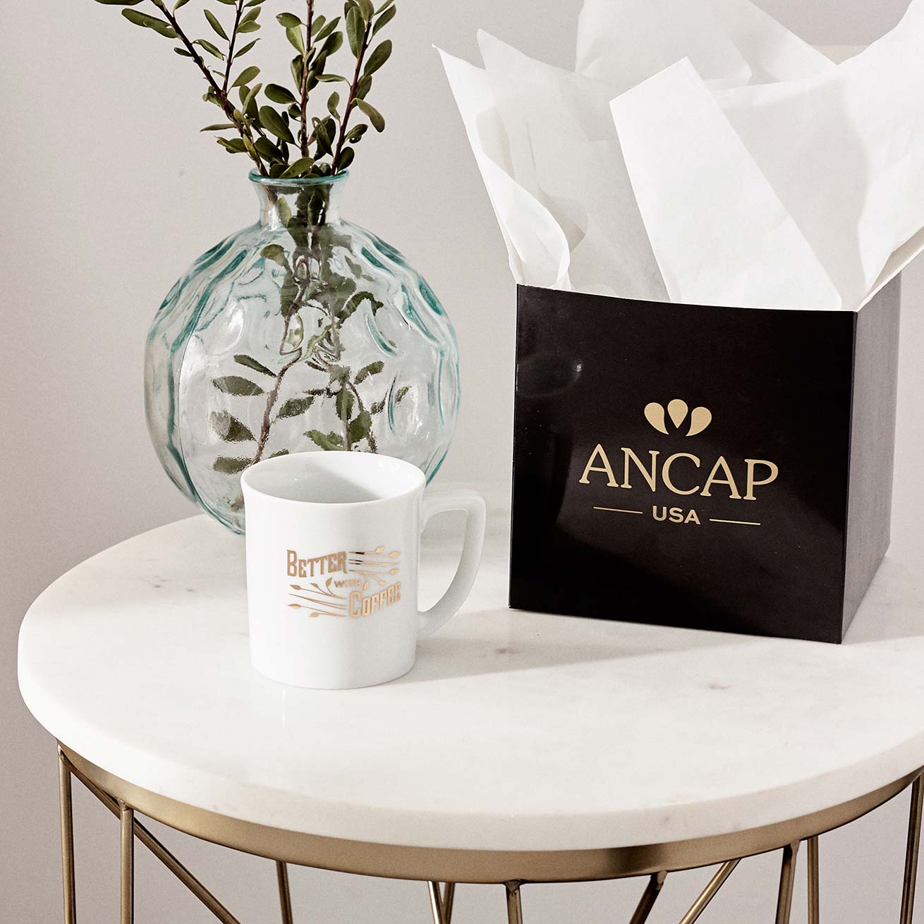
It’s always great to work on a project that you can actually hold in your hands. This one certainly did not disappoint.

My initial design was far simpler, and it gave the shape that I wanted, but since it was going to be a gold decal I wanted it to be a little ornate and have a little less weight.
I knew that I wanted somethingwhere I placed the lines but it felt kinda like a flag. I wanted it to be an element that connected the design to the mug more accurately.

Using coffee leaves as a reference I changed the three bars into branches with coffee leaves. I wanted the merch to represent what you would use it for.

The gold in the decal fits well with the quality of Ancap porcelain which is manufactured in Italy.
Snag one here!
Check out another coffee related project here!